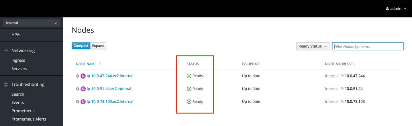
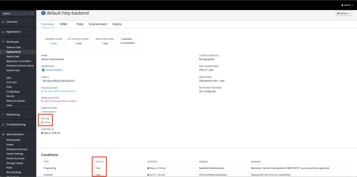
Resource Statuses
The status of resources is primarily displayed on pages such as Summary and Details pages. Other pages status may appear on are Subscriptions and Search.
Summary Page
Details Page
High Level Recommendations
Status can be displayed in a number of ways depending on the use case and page content. When displaying status in the console, use the following design recommendations regarding the visual treatment.
Example Statuses
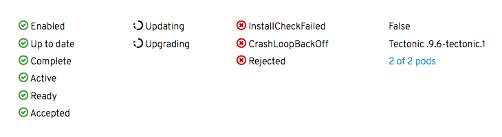
If a status has a recommended icon, show the status with both the icon and the associated status text. For cases where a status does not have a recommended icon, only show the status text.
Icons
- Visual design
- Active/Ready/Complete: pficon-ok
- Error/Failure: pficon-error-circle-o
- Warning: pficon-warning-triangle-o
- Updating/Progress: pficon-in-progress
- Colors
- Green: pf-green-400 #3F9C35
- Red: pf-red-100 #CC0000
- Orange: pf-orange-400 #EC7A08
- Black: pf-black #030303
Spacing
- Dependent on context and element sizes
- Icon and text should never touch
Text
- Sentence style
- Note: In cases where a status is a reason string condition, the status may remain in camel case with no spaces.
- Color
- Black: pf-black #030303
- Blue: pf-blue-400 #0088CE (for links only)